Cavs Introduce New Court for 2017 Season
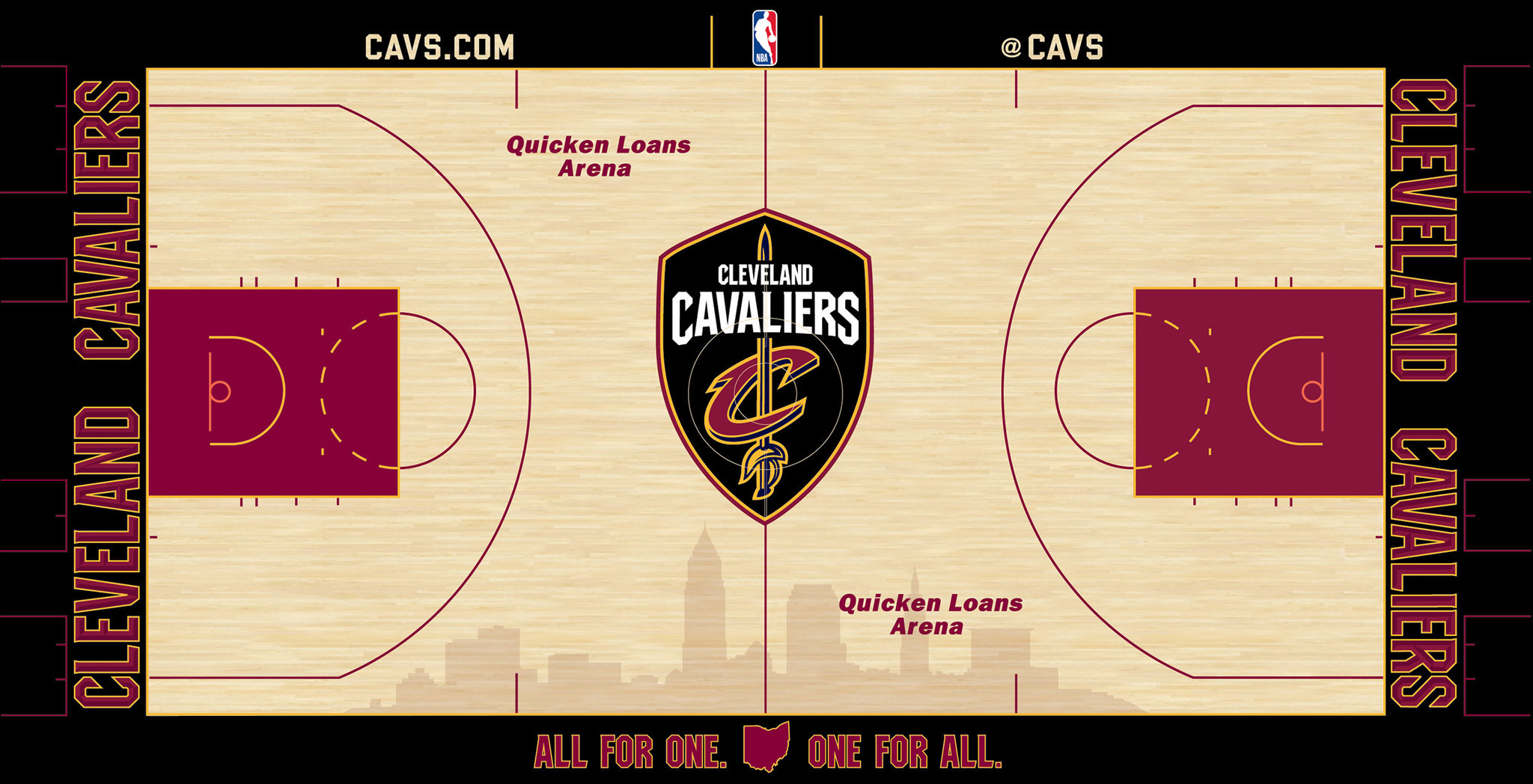
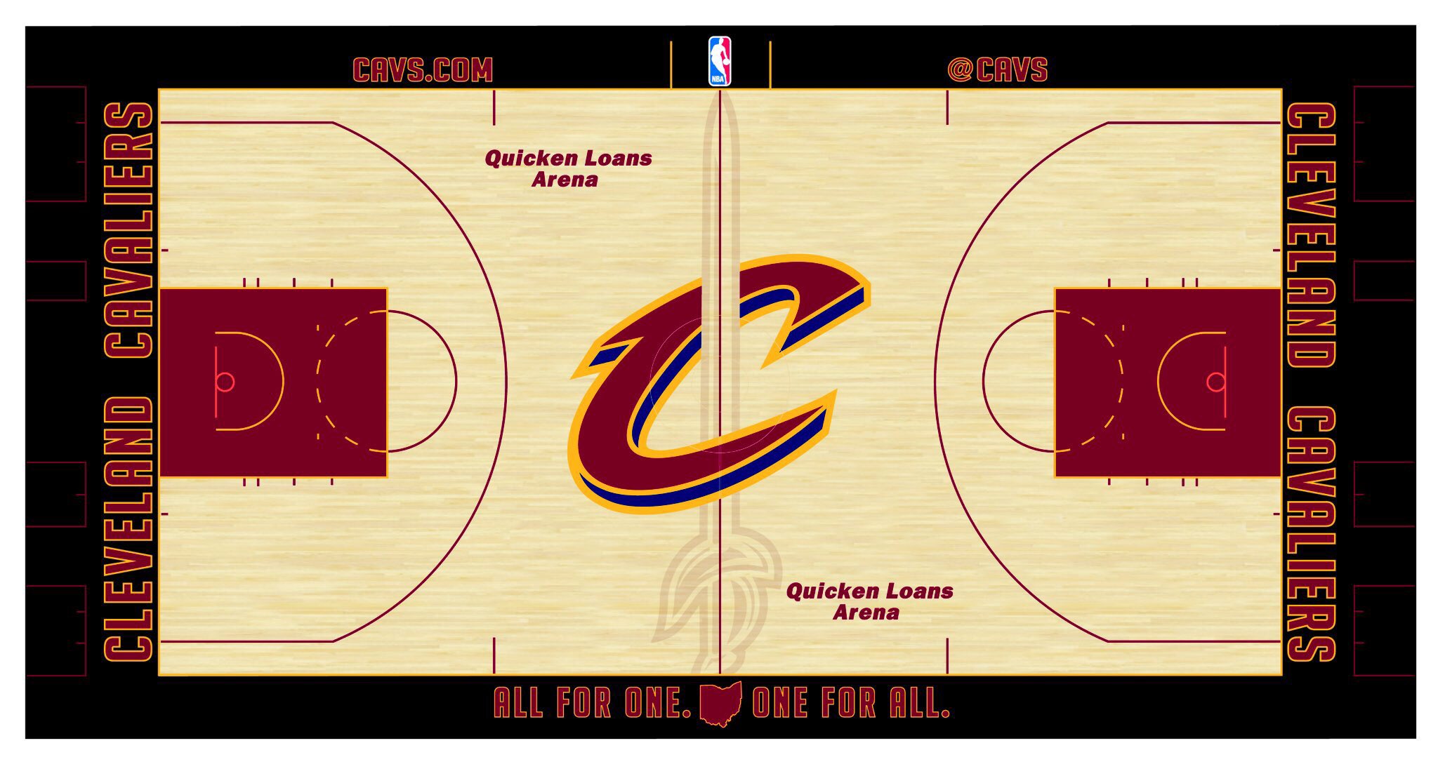
On September 7, 2017, the Cavaliers unveiled a new court reflecting the new logo suite.
We keep track of this stuff here.
New Cavaliers Court Design Features
The maple hardwood floor features a light stain throughout the entire court and is framed with a bold black perimeter. Black was officially introduced as a new and permanent addition to the Cavaliers color palette as part of the team’s updated brand. The color black is a nod to the historic turning point in the 2016 NBA Finals when the Cavs wore their black-sleeved uniforms in games 5 and 7 of the NBA Finals on their way to winning the NBA Championship. The lane is solid wine with bright gold accents.
Displayed at center court is the team’s recently introduced global logo, “The Shield,” which salutes Cleveland’s emergence, and the Cavaliers prominent brand presence within the international marketplace. Cavs games are broadcast in over 192 countries and 13 territories throughout the world in 47 different languages. “The Shield” is also a nod to the some of the most engaged and passionate Cavs fans, including Wine & Gold United (the team’s year-round season ticket based club).

A shaded silhouette of the Cleveland skyline is front and center on the bottom half of the court represents the pride and excitement the Cavs bring to the city and region, and the special bond that exists between the team, the fans and the community.
The baselines, painted in black, display the new aggressive “Cleveland Cavaliers” font in wine and gold with sharp edges that are inspired by the sword. “Quicken Loans Arena” can be read on each half court, and the east sideline features “Cavs.com” near the home bench with the team’s Twitter handle “@Cavs” at the visitor’s bench. The Cavs DNA statement “All for One. One for All.” is centered on the west sideline and will include the names of all Wine & Gold United members (the team’s year-round season ticket based club) within the letters.
Designed by the Cavaliers graphics team, the court was constructed by Cincinnati Floor Company in Cincinnati, OH. It is composed of 210, 4’ x 8’ pieces and 15, 4’ x 4’ pieces, and takes approximately one hour to assemble.

