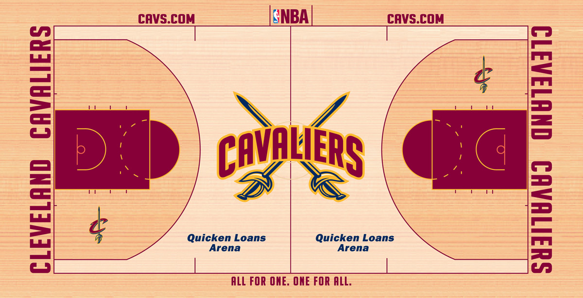
New Cavaliers Court Design
The guys over at RealCavsFans.com found it first.
The Cavaliers have made a big update to the court design at the Q for the 2010-2011 season. In the tradition of what we can trust from Dan Gilbert, we can expect him to never stand pat and keep investing in the team. From new seats, new colors, new training facilities and now a great new court design. The guy just gets it.

New Court Design
I’m pretty excited about the court design because it shows two great things.
- Really limits the amount of blue on the floor. We are wine and gold (with a little blue), not BLUE, wine and gold.
- We are starting to see less and less of the script Cavaliers logo. Hopefully, in time, the Cavs will do away with it permanently and go back to the arching block letter “Cavaliers” that once made Bingo look so heroic.
I’ve always been a fan of teams that stick with traditional logos and jerseys. The Cavs have probably been more active in following the fads than any other team (remember the 90’s?… wow). So, I think its promising we are seeing the gradual move back to our 70’s past.
Take a walk down memory lane and check out all of the Cavs court designs over the last 40 some odd years.